Today I signed off Unity Theatre’s season brochure – the last of my six year tenancy as Marketing Manager (I’m going to Theatre Clwyd and am dead excited as you will undoubtedly discover over the next 6 months!) – and I felt a wave of emotions briefly as I said “yes, print it”.
The first was relief, that was quickly overcome by sadness that that was it, done, and that was even more quickly overwhelmed by reminiscence. I can chart the progression of Unity’s marketing and its development over the past 6 years through the brochures most clearly – each one filled with battles won and lost, decisions correct or not, lessons learned – many of these side-by-side with changes in my life, my progression as a marketeer but also the solidification of an element of Unity’s brand over time.
I wanted to write a little bit about it to help clarify my thoughts about them, but also because they often get overlooked in marketing conversations. We regularly (and rightly) talk about social media, digital, CRM, experience management and more, but rarely about the place of one of our staples, the fibre of the marketing world, keeping us regular – the humble season brochure.
I appreciate that as I write this some people will read this who’ve abandoned them, others will be sticking rigidly to them. This is not suggesting that the way we worked is correct for everyone. The opposite, you should market as effectively as possible to the audience of your venue and your community – do what works not what’s necessarily fashionable or demanded by board members or friends.
 Why not get rid?
I remember about 10 years ago when I was starting to get into Arts Marketing attending an AMA conference where marketeers were confidently proclaiming that now we were entering a digital world that “brochures were dying” and predicting they would be deceased within 5 years. That never happened, nor did any of us predict that youtube would catch on, myspace would die and that people would ever find 120 character sentences (or tweets as they became known) interesting.
I was part of this “they’ll be dead crowd”, so why didn’t it happen? It didn’t happen for a few reasons, some economic, some brand and some job security led. Economically we were getting a good bump from sales when they were produced, not huge advanced bookers but a good chunk. In addition our website, digital profile and online booking was terrible and needed an overhaul and it made economic sense to distribute the brochure with lots of shows in rather than loads of different flyers (over 40 shows a season). The print we were receiving was pretty bad too – it had an air of the unprofessional at times – this was an easy way to gloss over that. However there was a limited budget of which it was eating far too much, it lacked clear brand direction, it wasn’t the most exciting or dynamic or USP led thing but it was tangibly doing a job in sustaining audiences effectively within resources.
 How Unity’s changed?
I had a mentor who said to me that “Rome wasn’t built in a day” and I think it’s quite true. What’s also true is that once Rome is built (or certainly the foundations are there…) you forget what things looked like before.
The change in Unity’s brochure happened over 2-3 years really – at the time I found it frustrating that the change didn’t happen quicker, but in retrospect it was necessary as lots of different things were aligning at the same time which is not an immediate transition. We never had enough money to do a full rebrand so instead changed things gradually – it started with rewriting copy, trying to remove the jargon, anything superfluous and really define who it was for: audiences (yes I know that’s vague, but I’m opposing this to people who work in theatre all the time). Sentence lengths shortened, academic language and jargon was phased out, plot and content came to the foreground, form and style to the background and the number of arguments with companies increased hugely as we ripped their copy apart and reassembled it for our use.
 Then came a design step change – we started thinking about values, what our work encapsulated, what was important to us. We also, ordered every brochure from every other theatre in the country and went through them with a fine tooth comb. If there was something clever we highlighted it, if the tone appealed we cut it out, if we hated it we found out exactly what we hated. It was a useful exercise in finding the things that we related to, that were exciting and dynamic. We had a challenging moment with our long standing designer and eventually parted ways and so auditioned (such a theatrical word, I mean “went through tendering”) from 8 designers to see a) how they related to the brief, b) whether we thought we could work with them, c) if they brought things to the table and d) price.
We had better copy, a designer who related to the theatre, our way of talking about the organisation was becoming, dare I say, less serious and we had found an aesthetic that worked. We changed the size of the brochure from a 150mm square to A5 – this cut costs dramatically, reduced our postage costs (for packaging) and we sourced the printer (rather than designer) meaning we could shop around a bit more.
 Obsession/Deconstruction
This began a period of time of “bringing together” which was essentially of aligning all the elements of Unity which had previously felt pretty disparate. We updated the website (with usability and navigation top of the agenda), examined our mailings, looked at how the building presented itself as we looked around and generally tried to improve everything one step at a time.
With the brochure we started a process of deconstruction after every brochure – we used audience and staff feedback to gradually refine what we had. This usually involved taking two brochures apart, gluing them to sheets of A3 and writing “this is shit” with massive red circles over anything that didn’t quite work, putting down new ideas and also using the retrospective knowledge of shows that didn’t sell and applying them to what we’d done to get “what we’d have done differently”. That was then applied to the next brochure and so on.
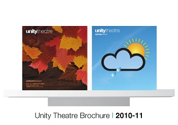
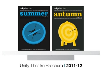
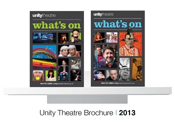
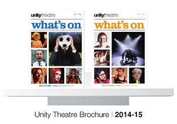
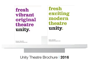
The brochure covers began as quite dark with a bold colour, reflective of where we were at the time, but also, in a city filled with great venues, something that helped make our brochure stand out and look dynamic and different against the others on offer (please note, I’m not saying better, just different). Then as we progressed we had natural development – firstly to place the shows at the core of what we were doing, then to go brighter and then to offer something completely different to coincide with a new artistic director.
As we progressed the content became tighter and tighter, the formatting became more exacting and the deconstruction kept continuing (top tip: always start by talking about what works otherwise you’ll feel drained after the meeting!). We made sure that the tone fitted our brand identity and also increasingly matched the positive audience perception but also the work that we put on stage.
 I was incredibly lucky in having a succession of Marketing Officers and Box Office Managers who were liberal with their opinions and were passionate in leading the charge. I can’t stress enough how important they were in making things develop and move forward. Two things that spring up that’s useful for brochures 1) make sure you’ve someone with a good bullshit detector and 2) be prepared to compromise sometimes. The bullshit detector is incredibly useful because we all write with a voice that is unique to us – sometimes it will sneak into things we’re writing (copy for example) and needs to be sought out and put right. In my case I can occasionally write “bullshit”. Or, more specifically, overly complicated complex sentences with an excessive amount of exclamation marks. Sometimes when you get deep into “brochuring” or “the marketeers burden” you can need this jolt to get you back on the straight and narrow and stop you hallucinating reviews and shows that are “unmissable!” The compromise element is that sometimes you can’t win every battle, it’s better to pick and choose what you’ll compromise on and give yourself more time to work on something else – after all time is finite.
This has all led (that was quick) to our latest brochure – the one I am most proud of – that I signed off today. It is thinner than all the others we’ve done, cheaper to produce and takes the smallest amount of the marketing budget than it ever has. I know there will be an error in it that we missed – there always is. I know that in a years time I will look at it and think it’s shit because the new thing I’m working on will have surpassed it in my mind. It will sell tickets. It will drive audiences better than its predecessors. It will tell people what Unity is about.
And it is throwaway.
The only place remembering those brochures past is this blog now. Something that’s worth remembering – it has a job to do and then it’s gone.
The future?
This kind of brings us back in full circle. Is the brochure still the thing? Will it be here in 5, 10, 15 years time?
I was thinking about this a lot recently and trying to define my thoughts. A couple of points below which will change in time, they will, I’m sure reverse, contradict or, upon finding something new out, be deleted from my consciousness completely. Here goes:
- They won’t die but will evolve – they have a function which is to drive audiences to the website as well as inform. There is room for editorial which few have really approached – for helping people understand what we do and why, and, for many of us, explain why we’re worthy of their time in a less sell, sell, sell, way. This feels a distance off at the moment…
- People like the tangible – ever noticed how people still go to real shops even though amazon exists. Some even go to bookshops. Some people find it hard to connect with digital everything. I like to scribble on my Edinburgh brochure, make notes, pass it to people. That’d hard to do with a PDF. For that reason I think they’ll survive. Maybe simplify, become more listingsy… Not everyone is a digitally-savvy, tablet-using, apple-loving, pdf-opening, hipster-bearded, digital native. They shouldn’t be excluded.
I’m aware I’ve not covered loads of stuff – from segmentation models, how we did distribution, the rise and fall of the mini-brochure, linking online and digital, why we removed the logo from the front cover (its become off-brand… oh the irony…) and also the merits of various paper stocks in relation to their brand values. However I hope this has been interesting to you marketing geeks – as always please share this article far and wide, send me a tweet @mrfreeman1984, follow me on facebook (click here) and leave a comment underneath.
Links
- Unity Theatre Website: Click Here
- Issuu stack of Unity Brochures: Click Here
- Issuu page of Unity Theatre: Click Here
- Unity’s Latest Brochure: Click Here
Best, Sam.