****Please Note: This is unremittingly a blog about theatre marketing, data and being smarter****
How it all started
About four months ago I was sat in a meeting at the theatre I work for as conversation bounced round the table. Every now and again a question would be asked or a statement stated – “how did that show do?” or “this year’s going much better/worse isn’t it” and I’d jot down the bit of information I’d need to run 3 or 4 reports by the next meeting to answer.
“If I have to run another shitting sales report they want a “minor tweak” to I will go on the rampage…”
A little while later I started to think, well, this was all just a bit silly. After all the data we need to make smarter decisions is sat in our box office system. In fact, there’s probably far more data in there than we know what to do with. But while we can run reports the process is incredibly time consuming and, crucially, the report will answer only the basic question we ask of it.
Let’s think about that most simple of question, raised countless times, “how did that show do?” You see that’s not the question which, when answered, helps you make a great decision. Exploring it a chain of questions might go something like this:
How Did That Show Go? > Was that just a bad year though? > How did it do compared to other shows in that year? > How did it go compared to other similar shows? > Did our members buy it? > Was it a shocker of a dog-shit show so we comped it to the extent of 300 tickets a night BUT because artistically it got 4 stars in The Guardian our collective memory has gone a bit awry?
It’s never ending and simply running reports destroys your time. Let’s imagine that every report takes 5 min to run… How many reports would get you to the answer? 5? 10? Would you have to get new reports made? Maybe it’ll take a day, week to turnaround? In the meantime a poorer decision might have been made.
Sometimes you need Jazz Hands…
So I found myself in this position wondering what to do. I also wondered how to use data to persuade people. Data is only as useful as the influence it can have and if it’s presented in a shit Excel chart then some people will turn off to it. So I needed something that would visually be simple to read, could answer questions fast, was completely customizable and, crucially, was pretty as a picture so that I could use it to show non-excel geeks.
I’m not interested in… Wait… Wow… What a lovely graph…
The solution has been Tableau (link here) a data visualisation piece of software where you import a .csv file in, move the data around and into different formats and then explore the data. It’s obviously a bit more complicated than that but you, yes you, reading this, can do it.
Below are some images of some of the dashboards that I’ve created as part of a Tableau file I’ve affectionately named Data Cruncha.
***Obviously much of the data is fake as the real version has actual financials in – use them to get an idea as to what’s possible!***
 Filtering The Data
The first thing to realise is that you can have near-instantaneous data to play with. This search criteria is a really simple version that I made to look at the data. It can run on whatever datasets you want in whatever combinations you need.
This one can filter by:
# Month (but it could do year/hour/day/week)
# Genre (depending on how your data is labelled)
# Who Produced The Show (depending on how your data is labelled)
# Venue (my theatre has 9 distinct venues…. sigh…)
# Whether a ticket was complimentary or not
# Whether a member purchased or not
# Or just looking at a single show…
You can essentially search by whatever dimensions (or categories) you have in your original data. So if you had an incredibly insightful box office manager who added in the show director into the show setup then you could potentially search by that. This ease of filtering is really important to know as it instantly updates every graph, chart and map you will see in the next few images.
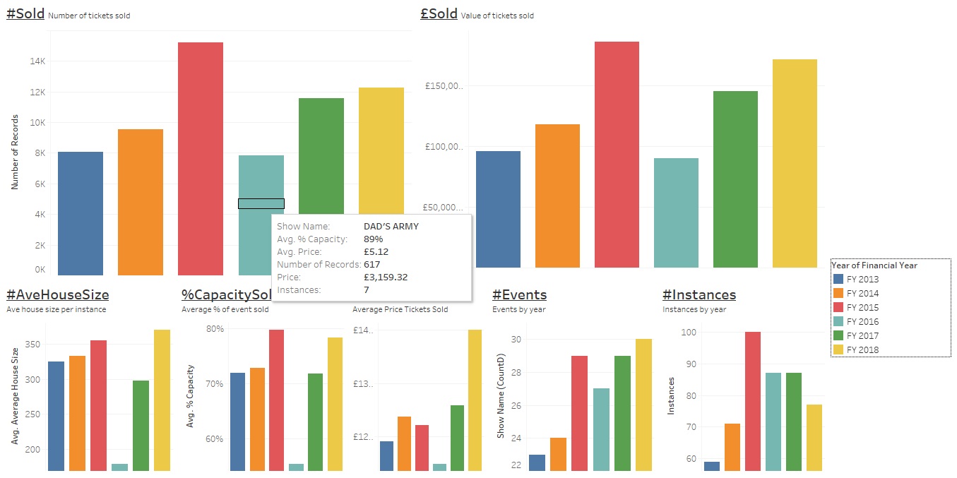
Sales Dashboard
This is exactly what it says on the tin – it pulls together all your basic sales data. Things to note:
- You can set up tooltips (the Dad’s Army box), essentially pop up bits of info that appear when you hover over data these can be populated with whatever you need.
- You can group the data in columns or lines or bar charts, by any time period.
- Each graph is made separately and then assembled on a dashboard. You choose what goes on which dashboard. This is great as you can start to visually see correlations in the data.
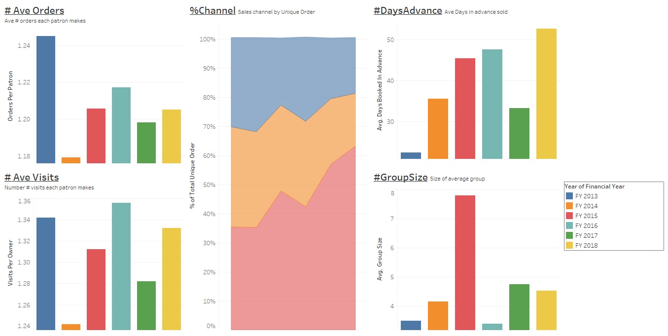
Behaviour Dashboard
This is (also) exactly what it says on the tin – it pulls some of the data about how your audience interact with you.
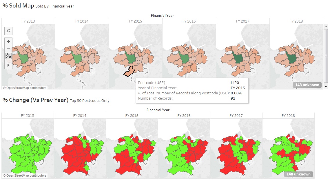
Mapping
A quick and easy way to use top line postcode data (e.g. CH7) to look at where you audience is coming from and how it’s changing.
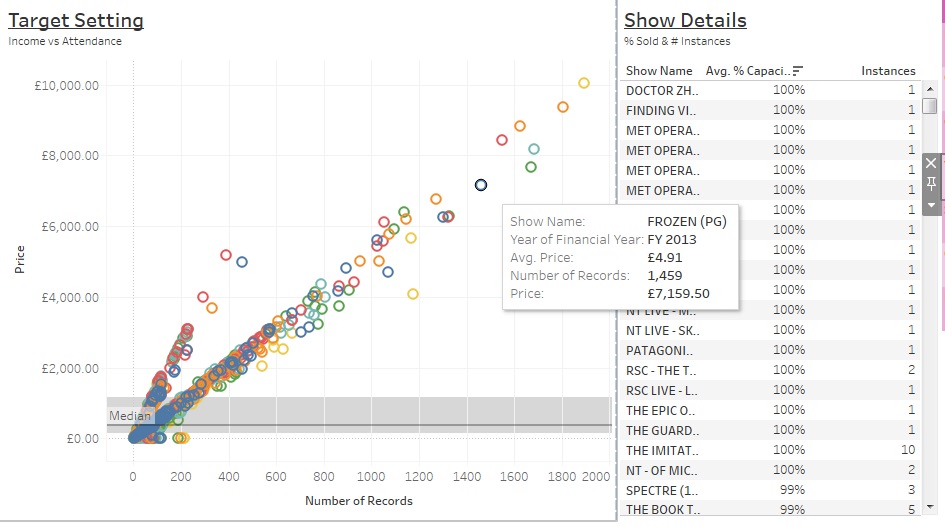
Target Setting Dashboard
Want to look at how a range of events performed – perhaps need some guidance of the best case and worst case scenarios? What’s interesting about the cinema data below is that if you look carefully you can distinguish between Live Screenings and Standard Films without a filter…
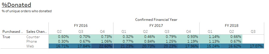
Donations Dashboard
You’ll also have line-by-line data on merchandise, donations and any transaction fees. All these can be reported on and explored.
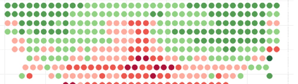
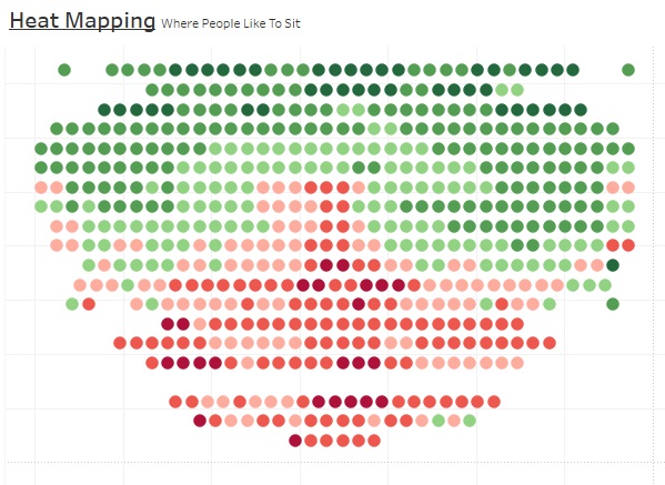
Heatmapping
This is the quite cool one. It’s useful for understanding how people book your tickets and which seats are in higher demand. You can then answer how well the house dresses itself. For reference the stage is at the bottom and red seats are the ones which have, on average, been booked most in advance (opposed to looking at frequency it’s been bought). Essentially if you want seat E16 our most popular seat then you’ll have to book 134.3 days before the show’s on… ish… (This is a real bit of data, but only for last year’s production of a touring comedy that sold out…)
What next?
Top question. Here’s my answer…
- Well if this is of interest then please tweet me @mrfreeman1984 with something cryptic like “#TopData” or “‘#CoolGraph”.
- You should also download the free demo version of Tableau which is available on their website and have a play with it… It’s really easy to use and it’ll help you try to learn if it’s going to be good for you or not.
- If you want to have a chat to me about what I’ve made or have a 10 minute online demo then drop me a tweet and we’ll see what we can do. (If you want a more in depth chat or me to make you something on a freelance basis either for money or free (if i like you or your theatre) then also get in touch.)
- Be fucking brave and not a massive wimp. Four months ago I tried this for the first time, I’ve been playing (yes, playing) with it in my spare time, learning by failing and then improving. It’s changed how I think of data. So give it a go.
- I’ve so far only scratched the surface of what this can do, of how it could be used organisationally… If you use this then get in touch, we’ll swap ideas and both become smarter.
I hope this is useful/interesting.
Best, Sam x